
UX / UI Design
DE&I External Site Redesign
The DE&I External Site Redesign aimed to improve how Moog publicly communicates its Diversity, Equity & Inclusion (DE&I) efforts by redesigning the external DE&I pages on moog.com. The existing page was outdated, lacked comprehensive content, and failed to clearly represent the company’s evolving DE&I initiatives and Employee Resource Groups (ERGs). This project involved redefining the information architecture, clarifying messaging, and creating a more user-centered experience that supports external engagement, employer branding, and recruiting goals.
Year :
2024
Industry :
Engineering & Manufacturing
Client :
Moog Inc.
Project Duration :
4 months
Role & Responsibilities
Role: Lead UX/UI Designer
Team: Cross-functional collaboration with Marketing, Content Owners, and Business Stakeholders
In this project, I was responsible for:
Collaborating with stakeholders to define primary user personas and journeys
Establishing an ideal content flow based on user and business needs
Proposing revised information architecture and content structure
Designing wireframes, interactive prototypes, and high-fidelity screens
Building and editing pages in Adobe Experience Manager (AEM)
Ensuring alignment with brand and accessibility standards
Tools: Figma, Figjam, Adobe Experience Manager, Photoshop

The Challenge
Moog’s existing external DE&I page lacked sufficient information about the company’s DE&I commitments, priorities, and active Employee Resource Groups. Multiple new ERGs and initiatives had been introduced since the original page was created, but these weren’t reflected online, which resulted in an incomplete narrative that did not meet the expectations of potential partners, prospective employees, or external audiences.
The structure made it difficult for users to:
Quickly understand Moog’s DE&I commitments
Discover relevant ERG information
Engage with the content in a way that aligns with their interests
The goal was to redesign the content structure and experience to better serve audiences while reinforcing organizational DE&I objectives.

Goals & Success Metrics
Primary Goals
Improve clarity and narrative around Moog’s DE&I commitments
Ensure content is accessible and easy to find
Support external engagement and recruiting efforts
Reflect the full scope of ERG initiatives
Success Metrics
Improved clarity and usability feedback from stakeholders
User testing metrics around task success and time-on-task
Completion of redesigned content delivered to marketing partners
Storytelling that aligns with audience expectations
Outcome: Although the redesigned pages were ultimately unpublished due to external political and regulatory changes, the project delivered a full, user-centered framework and clearly articulated content structure ready for rollout.
The Design Process
Due to confidentiality constraints, only select deliverables are shown. Please feel free to contact me if you’d like to discuss the full process or outcomes in more detail.
1. Discovery & Research
To understand how users would interact with the DE&I content, I conducted stakeholder interviews and collaborative workshops to gather insights on:
Who key external audiences are
What they want to learn about Moog’s DE&I commitments
What questions they need answered quickly
2. Define User Needs & Journey Mapping
Using the research findings, I created persona profiles and mapped core user journeys to understand common paths users would take through the DE&I content. This helped identify priority content and areas where clarity was needed most.

Current Moog Employees are one of the smaller user groups, but should still be included when thinking about our external pages.

Tom is one of the more significant user groups since many potential employees may join the company based on their DE&I initiatives and offerings.

With the original DE&I pages, Kristy was a persona who was not thought about when creating content. Within the redesign, it was important to include her and think about how we can provide her the information she needs to initiate partnership and collaboration.

Despite having our own Investor section on moog.com, investors also take interest in certain areas of the business to help decide investment with the company. Bill is a subset of an investor user group, who takes interest in the social initiatives we commit to.
3. Information Architecture & Content Strategy
Based on personas and journeys, I established a refreshed information architecture that emphasized:
Clear organization of DE&I initiatives
Logical grouping of ERGs and resources
A storytelling hierarchy that guides users from overview to details
This structure was reviewed and refined with business stakeholders to align audience needs with organizational priorities.

An initial site flow was introduced and reduced due to lack of external content available for ERG pages. Despite this, the site flow re-adapted by having one ERG page for all ERG information.

New site content was defined based on user persona needs established in the initial phase of the project.
4. Wireframing & Prototyping
Next, I developed iterative lo and hi-fidelity designs in Figma, focusing on layout, content hierarchy, and ease of navigation. These were used to validate design decisions with stakeholders and ensure clarity before development.

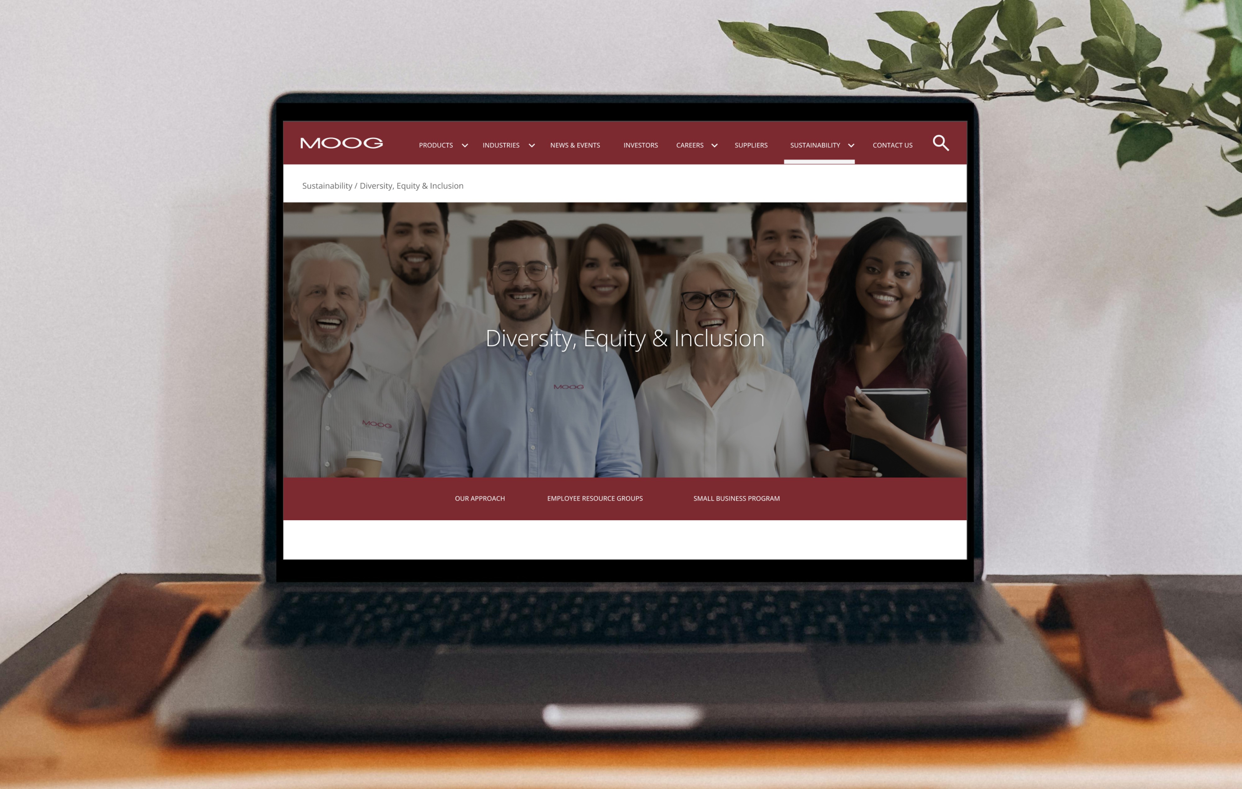
The home page went through several iterations due to content availability. Presented is the first iteration that was approved by business before going into hi-fidelity designs. The landing area of the home page has several redirects to its sub pages to help navigate our different personas to the content that they would like to see.

highlighted, showing how dedicated and passionate they are for the company's initiative. Having leadership contact made it easier for personas such as potential parters to get in contact about building relationships with Moog.

Visibility into how exactly we're applying our vision and strategic pillars within our company was important, so blogs and events were initially added for the team to role out on an as-done basis.

The following lo-fidelity pages were proposed back to stakeholders and received feedback for revision. Certain components were changed at a later date so it aligned with moog.com's styling standards and in-house components.

Hi-fidelity wireframes were finalized and received approval for publishing by Marketing and Graphic Design department. Images used are internal resources and align with DE&I initiatives described.
5. Implementation & Refinement
Once designs were approved, I built the redesigned pages in Adobe Experience Manager (AEM) and collaborated closely with Marketing and content owners to refine messaging and ensure brand consistency.
Solution
The redesigned DE&I pages delivered a structure that:
Clearly communicates Moog’s DE&I mission and values
Highlights active ERGs and initiatives
Supports easy navigation based on user priorities
Balances storytelling with informational clarity
Aligns with accessible, inclusive design principles
Despite the pages not being published long-term, the work established a scalable, user-centered foundation for external DE&I communication.


Results & Impact
Established DE&I personas and user journey frameworks
Redesigned information architecture with strategic content prioritization
Completed prototype and high-fidelity design delivered to stakeholders
Built UI within AEM aligned to brand and accessibility standards

What I Learned
Redesigns require flexibility when content is evolving
Aligning stakeholders early can significantly reduce iteration cycles
User journey mapping directly informs clarifying content hierarchy and creates success criteria for design goals
More Projects
UX / UI Design
DE&I External Site Redesign
The DE&I External Site Redesign aimed to improve how Moog publicly communicates its Diversity, Equity & Inclusion (DE&I) efforts by redesigning the external DE&I pages on moog.com. The existing page was outdated, lacked comprehensive content, and failed to clearly represent the company’s evolving DE&I initiatives and Employee Resource Groups (ERGs). This project involved redefining the information architecture, clarifying messaging, and creating a more user-centered experience that supports external engagement, employer branding, and recruiting goals.
Year :
2024
Industry :
Engineering & Manufacturing
Client :
Moog Inc.
Project Duration :
4 months
Role & Responsibilities
Role: Lead UX/UI Designer
Team: Cross-functional collaboration with Marketing, Content Owners, and Business Stakeholders
In this project, I was responsible for:
Collaborating with stakeholders to define primary user personas and journeys
Establishing an ideal content flow based on user and business needs
Proposing revised information architecture and content structure
Designing wireframes, interactive prototypes, and high-fidelity screens
Building and editing pages in Adobe Experience Manager (AEM)
Ensuring alignment with brand and accessibility standards
Tools: Figma, Figjam, Adobe Experience Manager, Photoshop
The Challenge
Moog’s existing external DE&I page lacked sufficient information about the company’s DE&I commitments, priorities, and active Employee Resource Groups. Multiple new ERGs and initiatives had been introduced since the original page was created, but these weren’t reflected online, which resulted in an incomplete narrative that did not meet the expectations of potential partners, prospective employees, or external audiences.
The structure made it difficult for users to:
Quickly understand Moog’s DE&I commitments
Discover relevant ERG information
Engage with the content in a way that aligns with their interests
The goal was to redesign the content structure and experience to better serve audiences while reinforcing organizational DE&I objectives.
Goals & Success Metrics
Primary Goals
Improve clarity and narrative around Moog’s DE&I commitments
Ensure content is accessible and easy to find
Support external engagement and recruiting efforts
Reflect the full scope of ERG initiatives
Success Metrics
Improved clarity and usability feedback from stakeholders
User testing metrics around task success and time-on-task
Completion of redesigned content delivered to marketing partners
Storytelling that aligns with audience expectations
Outcome: Although the redesigned pages were ultimately unpublished due to external political and regulatory changes, the project delivered a full, user-centered framework and clearly articulated content structure ready for rollout.
The Design Process
Due to confidentiality constraints, only select deliverables are shown. Please feel free to contact me if you’d like to discuss the full process or outcomes in more detail.
1. Discovery & Research
To understand how users would interact with the DE&I content, I conducted stakeholder interviews and collaborative workshops to gather insights on:
Who key external audiences are
What they want to learn about Moog’s DE&I commitments
What questions they need answered quickly
2. Define User Needs & Journey Mapping
Using the research findings, I created persona profiles and mapped core user journeys to understand common paths users would take through the DE&I content. This helped identify priority content and areas where clarity was needed most.
Current Moog Employees are one of the smaller user groups, but should still be included when thinking about our external pages.
Tom is one of the more significant user groups since many potential employees may join the company based on their DE&I initiatives and offerings.
With the original DE&I pages, Kristy was a persona who was not thought about when creating content. Within the redesign, it was important to include her and think about how we can provide her the information she needs to initiate partnership and collaboration.
Despite having our own Investor section on moog.com, investors also take interest in certain areas of the business to help decide investment with the company. Bill is a subset of an investor user group, who takes interest in the social initiatives we commit to.
3. Information Architecture & Content Strategy
Based on personas and journeys, I established a refreshed information architecture that emphasized:
Clear organization of DE&I initiatives
Logical grouping of ERGs and resources
A storytelling hierarchy that guides users from overview to details
This structure was reviewed and refined with business stakeholders to align audience needs with organizational priorities.
An initial site flow was introduced and reduced due to lack of external content available for ERG pages. Despite this, the site flow re-adapted by having one ERG page for all ERG information.
New site content was defined based on user persona needs established in the initial phase of the project.
4. Wireframing & Prototyping
Next, I developed iterative lo and hi-fidelity designs in Figma, focusing on layout, content hierarchy, and ease of navigation. These were used to validate design decisions with stakeholders and ensure clarity before development.
The home page went through several iterations due to content availability. Presented is the first iteration that was approved by business before going into hi-fidelity designs. The landing area of the home page has several redirects to its sub pages to help navigate our different personas to the content that they would like to see.
highlighted, showing how dedicated and passionate they are for the company's initiative. Having leadership contact made it easier for personas such as potential parters to get in contact about building relationships with Moog.
Visibility into how exactly we're applying our vision and strategic pillars within our company was important, so blogs and events were initially added for the team to role out on an as-done basis.
The following lo-fidelity pages were proposed back to stakeholders and received feedback for revision. Certain components were changed at a later date so it aligned with moog.com's styling standards and in-house components.
Hi-fidelity wireframes were finalized and received approval for publishing by Marketing and Graphic Design department. Images used are internal resources and align with DE&I initiatives described.
5. Implementation & Refinement
Once designs were approved, I built the redesigned pages in Adobe Experience Manager (AEM) and collaborated closely with Marketing and content owners to refine messaging and ensure brand consistency.
Solution
The redesigned DE&I pages delivered a structure that:
Clearly communicates Moog’s DE&I mission and values
Highlights active ERGs and initiatives
Supports easy navigation based on user priorities
Balances storytelling with informational clarity
Aligns with accessible, inclusive design principles
Despite the pages not being published long-term, the work established a scalable, user-centered foundation for external DE&I communication.
Results & Impact
Established DE&I personas and user journey frameworks
Redesigned information architecture with strategic content prioritization
Completed prototype and high-fidelity design delivered to stakeholders
Built UI within AEM aligned to brand and accessibility standards
What I Learned
Redesigns require flexibility when content is evolving
Aligning stakeholders early can significantly reduce iteration cycles
User journey mapping directly informs clarifying content hierarchy and creates success criteria for design goals