
UX / UI Design
Partner Portal Redesign
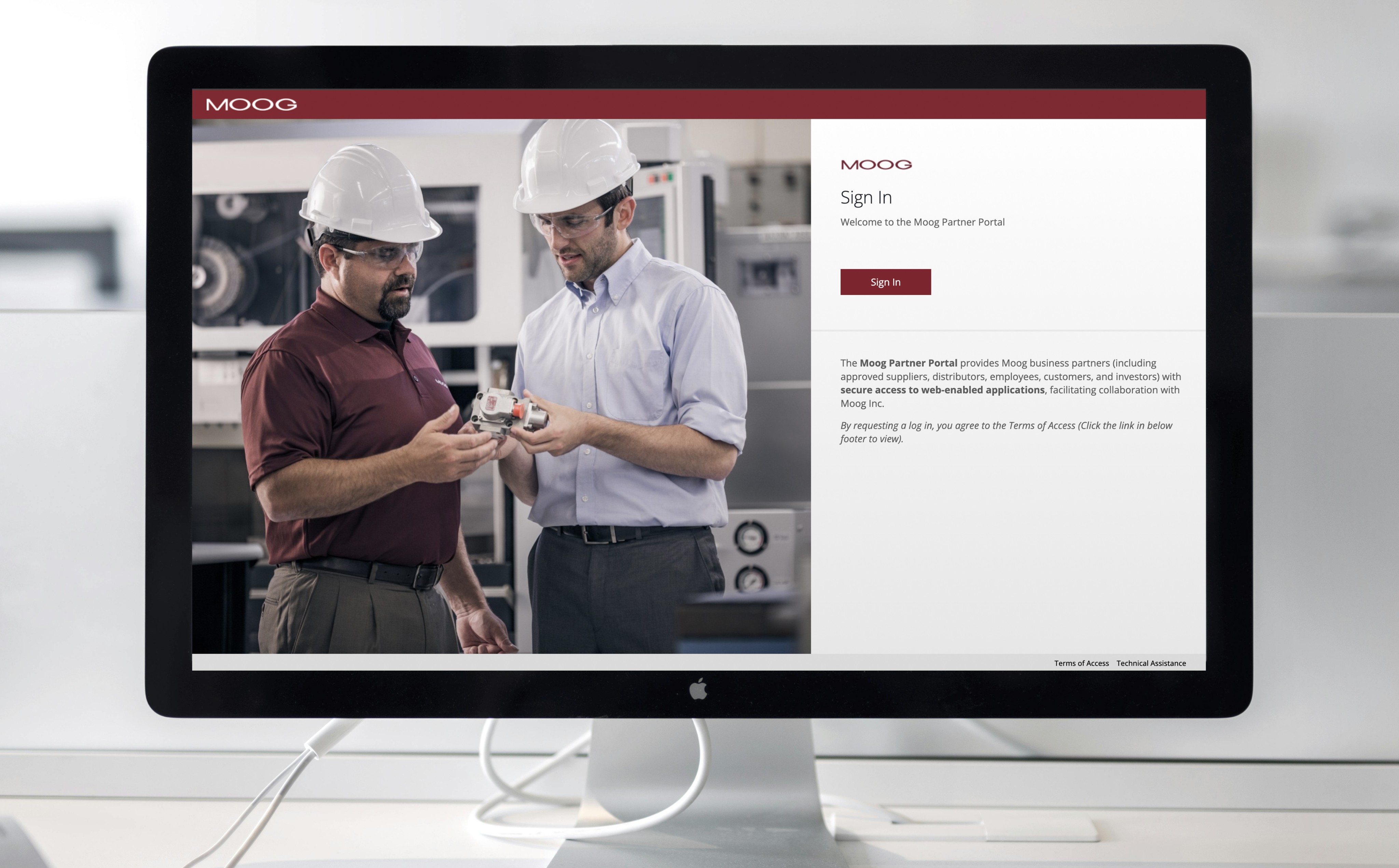
A redesign of Moog’s Partner Portal — an internal/external facing tool used by suppliers, manufacturers, and partner contacts to access Moog applications pertaining to their role. The goal was to improve usability, navigation, and content accessibility for our current set of user types while aligning the portal with updated brand standards.
Year :
2025
Industry :
Engineering & Manufacturing
Client :
Moog Inc.
Project Duration :
3 months
Role & Responsibilities
My Role & Responsibilities
Role: Lead UX/UI Designer
Key contributions:
Partnered with IT business stakeholders and developers to define requirements and system behavior
Redesigned information architecture and navigation across authenticated experiences
Designed both partner-facing portal and internal admin portal for account management
Established UI patterns aligned to brand and accessibility standards
Delivered responsive designs and supported implementation through dev handoff and QA
Tools: Figma, Microsoft Entra, Figjam, Visual Studio Code, Adobe Experience Manager

The Challenge
The existing partner portal showcased the following:
Fragmented login and navigation experience
Confusion around account setup and access permissions
Heavy reliance on IT for password resets and account management
Outdated UI and inconsistent branding
Lack of scalable admin tooling for internal teams

Goals & Success Metrics
Primary Goals:
Simplify navigation and improve content findability
Create a scalable information architecture
Align UI with brand and accessibility standards
Reduce cognitive load for frequent tasks
Success Metrics:
User acceptance criteria fulfillment
Time spent on key task flows (e.g., document download)
Stakeholder satisfaction feedback
Decrease in support tickets for common portal issues
The Design Process
Due to confidentiality constraints, only select deliverables are shown. Please feel free to contact me if you’d like to discuss the full process or outcomes in more detail.
1. Research & Requirement Alignment
I collaborated with IT application owners and stakeholders to define requirements, understand supplier pain points, and identify system constraints.
Key focus areas included:
Simplifying account setup and login for external suppliers with two-way factor authentication
Introducing role-based access using Microsoft Entra user groups
Defining dynamic application assignment and visibility based on user permissions
Identifying the need for a dedicated Admin Portal to manage users and access
2. Wireframing & Prototyping
To reduce friction during login and onboarding, I designed responsive wireframes and high-fidelity prototypes that prioritized clarity, accessibility, and consistency across devices.
Design efforts focused on:
Mapping an intuitive Microsoft Entra login flow
Designing role-based UI screens
Creating mobile, tablet, and desktop layouts (Desktop first since 85% of users use desktop)
Aligning component styling to Moog branding standards
Conditional screens for user interaction success, failure, and disabled states

Lo-Fidelity wireframes were created and iterated through based on CSS and styling constraints from Microsoft Entra. Wireframes were replicated in Entra sandbox environment to ensure design to dev capabilities.

Branding and web styling was pulled from current external site and applied to portal login and landing area. Desktop was designed for first since a majority of our users use desktop to access the portal. Tablet and mobile were designed after finalizing desktop.

Tablet dimensions and design layout were determined based on collaboration with developers.

Mobile dimensions and design layout were determined based on collaboration with developers. Figma allows for easy responsive design capabilities by correctly using auto layout and variables.
3. Design to Dev Code Handoff
I worked closely with developers to ensure feasibility and consistency, providing detailed Figma specifications and supporting implementation.
Handoff activities included:
Aligning designs with an existing React component library
Documenting user flow of navigation between custom application screens and Microsoft Entra
Delivering finalized CSS alongside design files with assistance of Figma Dev Mode
Reviewing implementation to ensure design intent was preserved
Iterating quickly to resolve feasibility and edge cases

A user flow diagram was handed over to developers to help understand all navigation flows and conditional layouts within the partner portal. The "See, Hover, Do" method was used for optimal hand-off.

CSS for color, typography, and display properties were handed over to developers for easy implemenation. CSS classes were also handed over if already known for UI component.

UI components received dimensions, link states, and conditional variations when being handed over.
4. Go-Live on Moog.com
To reduce confusion around account access, I redesigned the Partner Portal entry point on moog.com to provide clearer guidance and onboarding for external users.
Updates included:
Redesigning the access page within Adobe AEM
Clarifying calls-to-action for login and account setup
Improving visibility of onboarding resources and documentation
Aligning the experience with Moog’s external brand system

I collaborated with Partner Portal business and technical owners to define required language for page, and adapted section to in-house components available.
Solution
The redesigned portal:
Reduced time from login to application access by 60%
Reduced IT support requests through self-service admin tools
Improved clarity of navigation and account setup
Provided scalable foundation for future integrations


Results & Impact
The redesigned portal:
Reduced time from login to application access by 60%
Reduced IT support requests through self-service admin tools
Improved clarity of navigation and account setup
Provided scalable foundation for future integrations

What I Learned
Enterprise UX requires balancing business requirements, technical constraints, and user needs. This project reinforced the importance of early stakeholder alignment, scalable system thinking, and designing admin tools that support long-term adoption. By addressing both user and operational challenges, we created a solution that improved usability while reducing internal support burden.
More Projects
UX / UI Design
Partner Portal Redesign
A redesign of Moog’s Partner Portal — an internal/external facing tool used by suppliers, manufacturers, and partner contacts to access Moog applications pertaining to their role. The goal was to improve usability, navigation, and content accessibility for our current set of user types while aligning the portal with updated brand standards.
Year :
2025
Industry :
Engineering & Manufacturing
Client :
Moog Inc.
Project Duration :
3 months
Role & Responsibilities
My Role & Responsibilities
Role: Lead UX/UI Designer
Key contributions:
Partnered with IT business stakeholders and developers to define requirements and system behavior
Redesigned information architecture and navigation across authenticated experiences
Designed both partner-facing portal and internal admin portal for account management
Established UI patterns aligned to brand and accessibility standards
Delivered responsive designs and supported implementation through dev handoff and QA
Tools: Figma, Microsoft Entra, Figjam, Visual Studio Code, Adobe Experience Manager
The Challenge
The existing partner portal showcased the following:
Fragmented login and navigation experience
Confusion around account setup and access permissions
Heavy reliance on IT for password resets and account management
Outdated UI and inconsistent branding
Lack of scalable admin tooling for internal teams
Goals & Success Metrics
Primary Goals:
Simplify navigation and improve content findability
Create a scalable information architecture
Align UI with brand and accessibility standards
Reduce cognitive load for frequent tasks
Success Metrics:
User acceptance criteria fulfillment
Time spent on key task flows (e.g., document download)
Stakeholder satisfaction feedback
Decrease in support tickets for common portal issues
The Design Process
Due to confidentiality constraints, only select deliverables are shown. Please feel free to contact me if you’d like to discuss the full process or outcomes in more detail.
1. Research & Requirement Alignment
I collaborated with IT application owners and stakeholders to define requirements, understand supplier pain points, and identify system constraints.
Key focus areas included:
Simplifying account setup and login for external suppliers with two-way factor authentication
Introducing role-based access using Microsoft Entra user groups
Defining dynamic application assignment and visibility based on user permissions
Identifying the need for a dedicated Admin Portal to manage users and access
2. Wireframing & Prototyping
To reduce friction during login and onboarding, I designed responsive wireframes and high-fidelity prototypes that prioritized clarity, accessibility, and consistency across devices.
Design efforts focused on:
Mapping an intuitive Microsoft Entra login flow
Designing role-based UI screens
Creating mobile, tablet, and desktop layouts (Desktop first since 85% of users use desktop)
Aligning component styling to Moog branding standards
Conditional screens for user interaction success, failure, and disabled states
Lo-Fidelity wireframes were created and iterated through based on CSS and styling constraints from Microsoft Entra. Wireframes were replicated in Entra sandbox environment to ensure design to dev capabilities.
Branding and web styling was pulled from current external site and applied to portal login and landing area. Desktop was designed for first since a majority of our users use desktop to access the portal. Tablet and mobile were designed after finalizing desktop.
Tablet dimensions and design layout were determined based on collaboration with developers.
Mobile dimensions and design layout were determined based on collaboration with developers. Figma allows for easy responsive design capabilities by correctly using auto layout and variables.
3. Design to Dev Code Handoff
I worked closely with developers to ensure feasibility and consistency, providing detailed Figma specifications and supporting implementation.
Handoff activities included:
Aligning designs with an existing React component library
Documenting user flow of navigation between custom application screens and Microsoft Entra
Delivering finalized CSS alongside design files with assistance of Figma Dev Mode
Reviewing implementation to ensure design intent was preserved
Iterating quickly to resolve feasibility and edge cases
A user flow diagram was handed over to developers to help understand all navigation flows and conditional layouts within the partner portal. The "See, Hover, Do" method was used for optimal hand-off.
CSS for color, typography, and display properties were handed over to developers for easy implemenation. CSS classes were also handed over if already known for UI component.
UI components received dimensions, link states, and conditional variations when being handed over.
4. Go-Live on Moog.com
To reduce confusion around account access, I redesigned the Partner Portal entry point on moog.com to provide clearer guidance and onboarding for external users.
Updates included:
Redesigning the access page within Adobe AEM
Clarifying calls-to-action for login and account setup
Improving visibility of onboarding resources and documentation
Aligning the experience with Moog’s external brand system
I collaborated with Partner Portal business and technical owners to define required language for page, and adapted section to in-house components available.
Solution
The redesigned portal:
Reduced time from login to application access by 60%
Reduced IT support requests through self-service admin tools
Improved clarity of navigation and account setup
Provided scalable foundation for future integrations
Results & Impact
The redesigned portal:
Reduced time from login to application access by 60%
Reduced IT support requests through self-service admin tools
Improved clarity of navigation and account setup
Provided scalable foundation for future integrations
What I Learned
Enterprise UX requires balancing business requirements, technical constraints, and user needs. This project reinforced the importance of early stakeholder alignment, scalable system thinking, and designing admin tools that support long-term adoption. By addressing both user and operational challenges, we created a solution that improved usability while reducing internal support burden.