
UX Strategy
Global Internal Communications Digital Transformation
This project focused on transforming a global internal communications platform used by employees across multiple regions. The goal was to improve accessibility, engagement, and long-term adoption by redesigning the information architecture, user experience, and content strategy of an existing internal tool. The result was adopting a new software product for a more intuitive, centralized platform that better supported employees’ day-to-day needs while aligning with organizational goals.
Year :
2025
Industry :
Engineering & Manufacturing
Client :
Moog Inc.
Project Duration :
1 year
My Role & Responsibilities
Roles: UX/UI Analyst, IT Lead & Project Manager
I owned the UX process end-to-end, including:
Conducting UX evaluations and identifying usability gaps
Partnering with stakeholders to define requirements and success metrics
Analyzing and selecting software product with business and end-user requirement fulfillment
Designing and iterating on feature implementation and UI customization
Coordinating IT implementation tasks and supporting post-launch evaluation
Tools: Figjam, Figma, Canva, Monday.com, Smartsheet

The Challenge
The existing internal communications platform suffered from:
Low employee engagement and adoption
Inconsistent content organization across regions
Poor accessibility and usability for a global workforce
Difficulty maintaining and updating content long-term
With the current software contract nearing renewal, leadership needed to determine whether the platform could be improved enough to justify continued investment.

Goals & Success Metrics
Primary Goals:
Increase employee adoption and engagement
Improve findability of internal resources
Ensure accessibility for a global audience
Create a scalable structure for future content growth
Success Metrics:
Adoption rate after launch
Employee feedback and engagement signals
Reduced friction accessing internal information
Outcome: The new platform achieved 40% employee adoption within the first month of launch.
The Design Process
Due to confidentiality constraints, only select deliverables are shown. Please feel free to contact me if you’d like to discuss the full process or outcomes in more detail.
1. DISCOVERY & UX EVALUATION
I began by evaluating the existing platform to identify usability issues, content gaps, and structural inefficiencies. This included reviewing current usage patterns and gathering feedback from internal stakeholders.
Key insights:
Employees struggled to locate relevant information quickly
Content hierarchy did not align with user mental models
Application views were cluttered and inconsistent in layout

Nielsen Norman Group's usability heuristics were used as a guideline to evaluate the current system's functionality. To give a better analysis, fulfilled, unfulfilled, and half fulfilled values were given to each heuristic. The current system had 70% of fulfillment and room for improvement in certain criteria.

Reasoning was given for functionality and features that contributed to fulfilled heuristics. The system matched real world social media platforms, so it was easy to interact with and adopt.

Reasoning was given for functionality and features that contributed to half fulfilled and unfulfilled heuristics. The system was very simple, but that contributed it to lacking system feedback and desired user interactions.

Drew resembles the typical admin for the current platform. His persona pulls direct insight from interviewing the internal communications team and their needs and pain points.

Tiffany represents a typical employee: a shop floor worker. Because the majority of shop floor employees are not issued company laptops or phones, it was critical to prioritize their needs and pain points in order to achieve the project’s goal of global adoption and accessibility.

The last of the deliverables represent a user journey with our shop floor worker, Tiffany. During this journey, Tiffany accesses the platform on the shared computers on the shop floors, and goes through how she interacts with the platform throughout her shift.


2. DEFINING REQUIREMENTS
To align main stakeholders on requirements, I facilitated a requirements gathering workshop with our global internal communications team. During the workshop, we defined needed feature requirements and prioritized them.
High prioritized requirements:
Globalization with platform translations and closed captioning
Mobile access for Moog and personal devices
Content creation flexibility
Podcasting and livestreaming hosting
Employee survey for evaluating employee satisfaction
3. Solution Selection
Using the defined requirements, I evaluated top-rated internal communication software and engaged in vendor discussions. Official business requirement documents were sent and confirmed by vendor before onboarding them as a partner.
4. Designing Platform Features & UI
Through the 4 month implementation stage, I collaborated with our project team's graphic designer to adhere Moog branding to UI elements. In addition, I strategized with the application's business owner to translate business requirements to user story flows that utilize new features adopted.
Designs and user flows were iterated on through stakeholder feedback to ensure alignment with both user needs and business constraints.
Design implementation:
Accessible and global icons for spaces and user groups
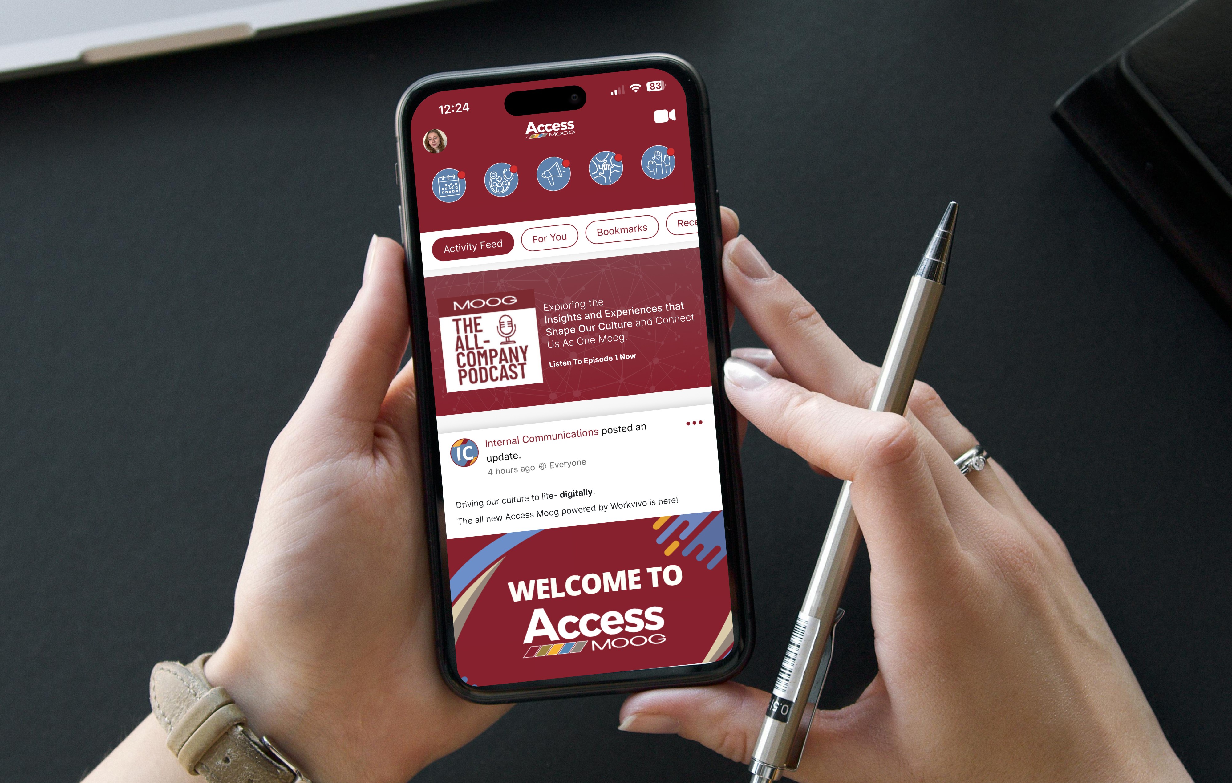
Podcast branding and marketing
Navigation bar information architecture
Banners and global application hub UI

The final widget represented in the UI was chosen because having the icons in a row adjacent to the text gave the best visual balance.

The secondary blue color was chosen to align with our internal branding standards.

The final cover is simple yet elevated to align with our branding but also allow for adaptability with our podcast content.
5. IT Integration & Implementation
Coordinated all IT tasks for project to ensure smooth launch to 14,000 global employees. I communicated technical requirements to IT teams and validated functionality before launch.
IT integrations:
Workday employee data as user provisioning and user groups for targeted communications (location, country, function, etc.)
Single Sign On as mandatory login on company-issued devices
Outlook email whitelisting and custom DNS integration
Microsoft Teams integration for additional platform accessibility
Updating SharePoint redirects and UI with new platform URL
Solution
The final solution delivered:
A centralized, user-focused internal communications platform
Improved navigation and content clarity
A scalable structure that supports global teams
A more accessible experience aligned with inclusive design principles


Results & Impact
~50% employee adoption in the first month
Improved clarity and usability of internal communications
Increased confidence from leadership in the platform’s long-term viability
Reduced friction for employees accessing internal resources

What I Learned
Internal tools require just as much user advocacy as external products
Clear information architecture is critical for global audiences
Early stakeholder alignment significantly improves implementation outcomes
More Projects
UX Strategy
Global Internal Communications Digital Transformation
This project focused on transforming a global internal communications platform used by employees across multiple regions. The goal was to improve accessibility, engagement, and long-term adoption by redesigning the information architecture, user experience, and content strategy of an existing internal tool. The result was adopting a new software product for a more intuitive, centralized platform that better supported employees’ day-to-day needs while aligning with organizational goals.
Year :
2025
Industry :
Engineering & Manufacturing
Client :
Moog Inc.
Project Duration :
1 year
My Role & Responsibilities
Roles: UX/UI Analyst, IT Lead & Project Manager
I owned the UX process end-to-end, including:
Conducting UX evaluations and identifying usability gaps
Partnering with stakeholders to define requirements and success metrics
Analyzing and selecting software product with business and end-user requirement fulfillment
Designing and iterating on feature implementation and UI customization
Coordinating IT implementation tasks and supporting post-launch evaluation
Tools: Figjam, Figma, Canva, Monday.com, Smartsheet
The Challenge
The existing internal communications platform suffered from:
Low employee engagement and adoption
Inconsistent content organization across regions
Poor accessibility and usability for a global workforce
Difficulty maintaining and updating content long-term
With the current software contract nearing renewal, leadership needed to determine whether the platform could be improved enough to justify continued investment.
Goals & Success Metrics
Primary Goals:
Increase employee adoption and engagement
Improve findability of internal resources
Ensure accessibility for a global audience
Create a scalable structure for future content growth
Success Metrics:
Adoption rate after launch
Employee feedback and engagement signals
Reduced friction accessing internal information
Outcome: The new platform achieved 40% employee adoption within the first month of launch.
The Design Process
Due to confidentiality constraints, only select deliverables are shown. Please feel free to contact me if you’d like to discuss the full process or outcomes in more detail.
1. DISCOVERY & UX EVALUATION
I began by evaluating the existing platform to identify usability issues, content gaps, and structural inefficiencies. This included reviewing current usage patterns and gathering feedback from internal stakeholders.
Key insights:
Employees struggled to locate relevant information quickly
Content hierarchy did not align with user mental models
Application views were cluttered and inconsistent in layout
Nielsen Norman Group's usability heuristics were used as a guideline to evaluate the current system's functionality. To give a better analysis, fulfilled, unfulfilled, and half fulfilled values were given to each heuristic. The current system had 70% of fulfillment and room for improvement in certain criteria.
Reasoning was given for functionality and features that contributed to fulfilled heuristics. The system matched real world social media platforms, so it was easy to interact with and adopt.
Reasoning was given for functionality and features that contributed to half fulfilled and unfulfilled heuristics. The system was very simple, but that contributed it to lacking system feedback and desired user interactions.
Drew resembles the typical admin for the current platform. His persona pulls direct insight from interviewing the internal communications team and their needs and pain points.
Tiffany represents a typical employee: a shop floor worker. Because the majority of shop floor employees are not issued company laptops or phones, it was critical to prioritize their needs and pain points in order to achieve the project’s goal of global adoption and accessibility.
The last of the deliverables represent a user journey with our shop floor worker, Tiffany. During this journey, Tiffany accesses the platform on the shared computers on the shop floors, and goes through how she interacts with the platform throughout her shift.
2. DEFINING REQUIREMENTS
To align main stakeholders on requirements, I facilitated a requirements gathering workshop with our global internal communications team. During the workshop, we defined needed feature requirements and prioritized them.
High prioritized requirements:
Globalization with platform translations and closed captioning
Mobile access for Moog and personal devices
Content creation flexibility
Podcasting and livestreaming hosting
Employee survey for evaluating employee satisfaction
3. Solution Selection
Using the defined requirements, I evaluated top-rated internal communication software and engaged in vendor discussions. Official business requirement documents were sent and confirmed by vendor before onboarding them as a partner.
4. Designing Platform Features & UI
Through the 4 month implementation stage, I collaborated with our project team's graphic designer to adhere Moog branding to UI elements. In addition, I strategized with the application's business owner to translate business requirements to user story flows that utilize new features adopted.
Designs and user flows were iterated on through stakeholder feedback to ensure alignment with both user needs and business constraints.
Design implementation:
Accessible and global icons for spaces and user groups
Podcast branding and marketing
Navigation bar information architecture
Banners and global application hub UI
The final widget represented in the UI was chosen because having the icons in a row adjacent to the text gave the best visual balance.
The secondary blue color was chosen to align with our internal branding standards.
The final cover is simple yet elevated to align with our branding but also allow for adaptability with our podcast content.
5. IT Integration & Implementation
Coordinated all IT tasks for project to ensure smooth launch to 14,000 global employees. I communicated technical requirements to IT teams and validated functionality before launch.
IT integrations:
Workday employee data as user provisioning and user groups for targeted communications (location, country, function, etc.)
Single Sign On as mandatory login on company-issued devices
Outlook email whitelisting and custom DNS integration
Microsoft Teams integration for additional platform accessibility
Updating SharePoint redirects and UI with new platform URL
Solution
The final solution delivered:
A centralized, user-focused internal communications platform
Improved navigation and content clarity
A scalable structure that supports global teams
A more accessible experience aligned with inclusive design principles
Results & Impact
~50% employee adoption in the first month
Improved clarity and usability of internal communications
Increased confidence from leadership in the platform’s long-term viability
Reduced friction for employees accessing internal resources
What I Learned
Internal tools require just as much user advocacy as external products
Clear information architecture is critical for global audiences
Early stakeholder alignment significantly improves implementation outcomes