
Graphic Design
RIT Racing Elevated Branding & Marketing Initiative
A comprehensive marketing and branding initiative for RIT Racing, focusing on visual identity, collateral design, and digital promotional materials. The intent was to raise visibility, unify brand expression, and support recruitment and sponsorship goals.
Year :
2023 - 2024
Industry :
Motorsports Engineering
Client :
RIT Racing
Project Duration :
2 years
Roles & Responsibilities
Role: Business Operations Associate, Graphic Designer, Digital Marketing Coordinator
Key responsibilities:
Defined branding deliverables with typography and color system
Designed digital and print marketing assets
Created branded merchandise for team and fans
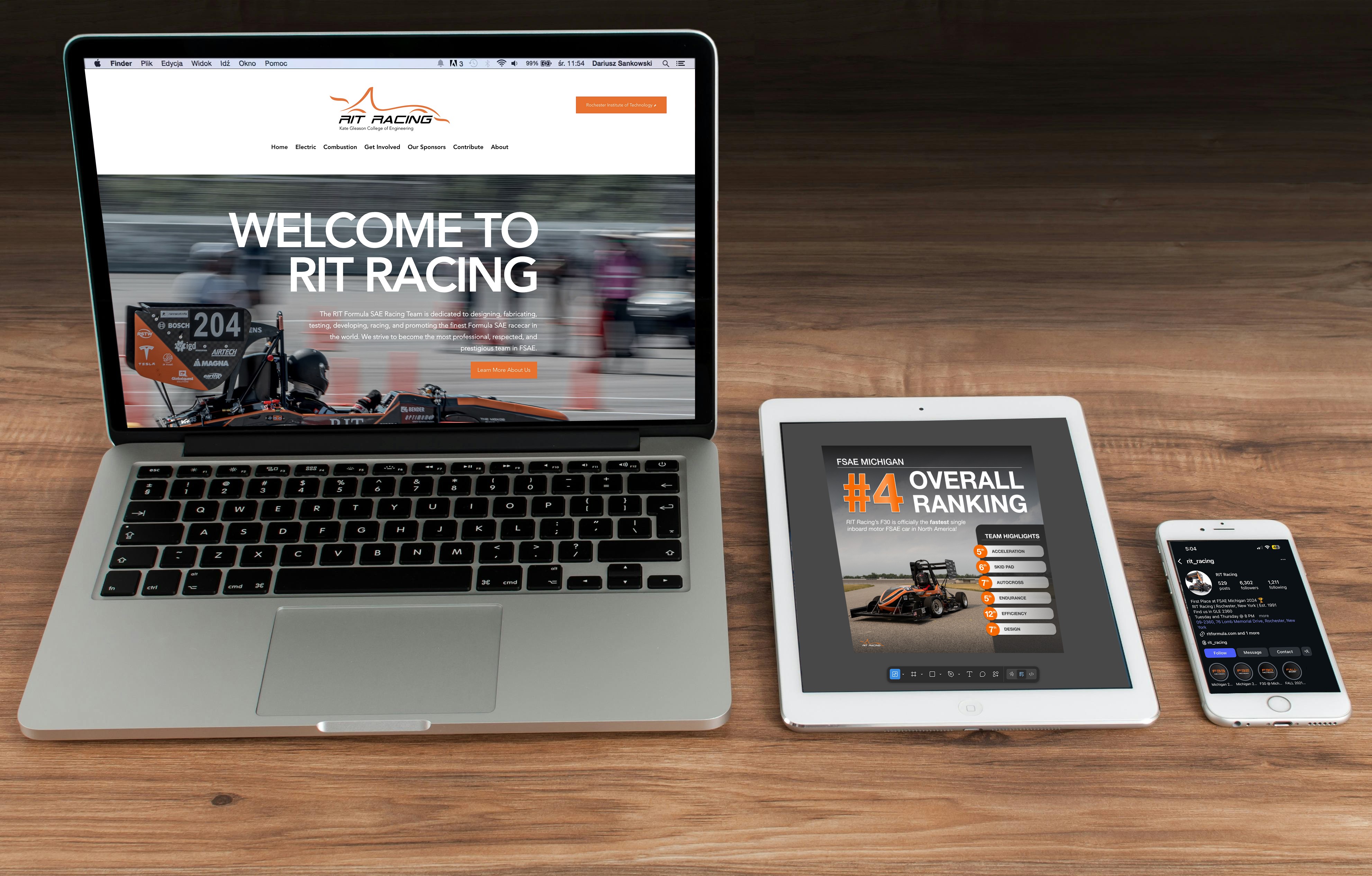
Redesigned RIT Racing website for improved content findability and brand alignment
Tools: Figma, Illustrator, Photoshop, InDesign, Meta Business Suite, Wix

The Challenge
RIT Racing’s existing branding lacked consistency across touchpoints. Marketing assets differed in style, and there was no unified visual language to support public engagement or sponsorship activation.
The design needed to:
Appeal to technical audiences and general audiences
Communicate rigor, innovation, and team spirit
Provide flexible brand elements for web, print, and events

Goals & Success Metrics
Primary Goals
Develop a cohesive brand system
Elevate RIT Racing’s visual presence
Produce key marketing deliverables for ongoing use
Success Metrics
Sponsor and follow satisfaction with social media and marketing content
Consistent application of branding across media
Increased social engagement post-launch
Outcome: Increased social media following on Instagram by 110%, and on average, 1300 likes per post during residency. Received praise of professional and clean social media presence by other FSAE teams and sponsors.
The Design Process
Due to confidentiality constraints, only select deliverables are shown. Please feel free to contact me if you’d like to discuss the full process or outcomes in more detail.
Social Media Posts
Posts shown were posted on RIT Racing's Instagram and Facebook to engage fans and sponsors on RIT Racing's accomplishments and captivating innovation. Posts shown received hundreds of likes and helped drive new followers and sponsors to our team.

The gradient on the #4 is meant to resemble a medal while still aligning with the RIT orange branding.

Checkers were used to take up space with the image while providing contrast to the text in front of it, making it pop.

Bars or rectangles are used for this post to invoke motion like that of a racecar.

The rectangle is used to take up space of the sky. There's visual harmony between the edge of the rectangle and text of "NEW", which elevates the design with just one simple shape.

Outlining text in this post allowed for differentiation in our content but still aligned with our branding.

Circles were used to create texture in the graphic and balance the large money raised title.

Orange is used for the "Link In Bio" text to draw users to our profile.

A simple graphic that uses the $15k money value as texture in the background. Clear visual hierarchy is declared with the use of font-size and color.

The orange rectangles were used to align with RIT's branding and symbolizes either a corn hole bag or board, which were at the yard game event.
POSTERS
Posters shown were hung up around RIT campus for student engagement and recruitment.

This graphic is meant to redirect users to our social media to learn more. By keeping the poster to an action image and minimal text, it is easy for the user to read and understand the content.

The main tagline and "Calling All Majors" is meant to be the main takeaway from the poster. We wanted to catch people's eye quickly and let them know that technical skill is not needed to join our team.

Newsletter has an orange column to help provide better scanning of newsletter content, Creating two distinct areas to rad.

Required text for this poster was fitted to have harmony or balance with the car presented.
F32 Livery Design
The car is the most visible asset the team has—at competitions, in sponsor decks, on social media, and in recruitment materials. The livery functions as a billboard that reinforces the team’s identity, and I had the honor designing it solely myself.

Presented is the finished car. I worked hands on with team managers and painter to adapt my Illustrator drawing to a real-life race car.

The triangles on the car are meant to represent an aggressive and edgy design that mimics the competitiveness of our team. Triangles are placed on the car to naturally fit the lines of the car.

Contrast in color, texture, and size are prevalent throughout the livery. Throughout the design process, I iterated through multiple versions of varying color, size, and texture until there was a balance between the three.

Black parts of the livery represent the carbon fiber of the chassis. It will be checkered and slightly darker than the grey paint.
Merchandise
By designing merchandise for team members, RIT students, and sponsors, we were able to reinforce visual identity wherever we go.

The front of our F32 sponsor t-shirt has a grid on it to make it look like a CAD drawing and provide subtle texture behind the car outline.

The back of the F32 sponsor shirt uses contrast in sponsor logo size based on the sponsor's donation to the team.

This t-shirt showcases the team's most well-performed cars across the years. The cars were connected using a line vector to symbolize a timeline.

The following is a flag design that was displayed at all RIT Racing events and sold to interested supporters. The checkered pattern features a fading opacity to mimic the appearance of carbon fiber—the material used for the car chassis—when light hits it.
Solution
The final branding delivered:
A unified visual identity system
A flexible color/treatment library for varied applications
Marketing assets aligned to RIT Racing's professional goals


Results & Impact
Strengthened visual presence for events and recruitment
Improved consistency in external communication
Positive response from internal stakeholders and potential sponsors

What I Learned
Brand systems can be scaled with maturity, but core elements like typography and color must remain consistent throughout the process
Cross-channel consistency supports stronger recognition (i.e, Instagram, Facebook, LinkedIn)
More Projects
Graphic Design
RIT Racing Elevated Branding & Marketing Initiative
A comprehensive marketing and branding initiative for RIT Racing, focusing on visual identity, collateral design, and digital promotional materials. The intent was to raise visibility, unify brand expression, and support recruitment and sponsorship goals.
Year :
2023 - 2024
Industry :
Motorsports Engineering
Client :
RIT Racing
Project Duration :
2 years
Roles & Responsibilities
Role: Business Operations Associate, Graphic Designer, Digital Marketing Coordinator
Key responsibilities:
Defined branding deliverables with typography and color system
Designed digital and print marketing assets
Created branded merchandise for team and fans
Redesigned RIT Racing website for improved content findability and brand alignment
Tools: Figma, Illustrator, Photoshop, InDesign, Meta Business Suite, Wix
The Challenge
RIT Racing’s existing branding lacked consistency across touchpoints. Marketing assets differed in style, and there was no unified visual language to support public engagement or sponsorship activation.
The design needed to:
Appeal to technical audiences and general audiences
Communicate rigor, innovation, and team spirit
Provide flexible brand elements for web, print, and events
Goals & Success Metrics
Primary Goals
Develop a cohesive brand system
Elevate RIT Racing’s visual presence
Produce key marketing deliverables for ongoing use
Success Metrics
Sponsor and follow satisfaction with social media and marketing content
Consistent application of branding across media
Increased social engagement post-launch
Outcome: Increased social media following on Instagram by 110%, and on average, 1300 likes per post during residency. Received praise of professional and clean social media presence by other FSAE teams and sponsors.
The Design Process
Due to confidentiality constraints, only select deliverables are shown. Please feel free to contact me if you’d like to discuss the full process or outcomes in more detail.
Social Media Posts
Posts shown were posted on RIT Racing's Instagram and Facebook to engage fans and sponsors on RIT Racing's accomplishments and captivating innovation. Posts shown received hundreds of likes and helped drive new followers and sponsors to our team.
The gradient on the #4 is meant to resemble a medal while still aligning with the RIT orange branding.
Checkers were used to take up space with the image while providing contrast to the text in front of it, making it pop.
Bars or rectangles are used for this post to invoke motion like that of a racecar.
The rectangle is used to take up space of the sky. There's visual harmony between the edge of the rectangle and text of "NEW", which elevates the design with just one simple shape.
Outlining text in this post allowed for differentiation in our content but still aligned with our branding.
Circles were used to create texture in the graphic and balance the large money raised title.
Orange is used for the "Link In Bio" text to draw users to our profile.
A simple graphic that uses the $15k money value as texture in the background. Clear visual hierarchy is declared with the use of font-size and color.
The orange rectangles were used to align with RIT's branding and symbolizes either a corn hole bag or board, which were at the yard game event.
POSTERS
Posters shown were hung up around RIT campus for student engagement and recruitment.
This graphic is meant to redirect users to our social media to learn more. By keeping the poster to an action image and minimal text, it is easy for the user to read and understand the content.
The main tagline and "Calling All Majors" is meant to be the main takeaway from the poster. We wanted to catch people's eye quickly and let them know that technical skill is not needed to join our team.
Newsletter has an orange column to help provide better scanning of newsletter content, Creating two distinct areas to rad.
Required text for this poster was fitted to have harmony or balance with the car presented.
F32 Livery Design
The car is the most visible asset the team has—at competitions, in sponsor decks, on social media, and in recruitment materials. The livery functions as a billboard that reinforces the team’s identity, and I had the honor designing it solely myself.
Presented is the finished car. I worked hands on with team managers and painter to adapt my Illustrator drawing to a real-life race car.
The triangles on the car are meant to represent an aggressive and edgy design that mimics the competitiveness of our team. Triangles are placed on the car to naturally fit the lines of the car.
Contrast in color, texture, and size are prevalent throughout the livery. Throughout the design process, I iterated through multiple versions of varying color, size, and texture until there was a balance between the three.
Black parts of the livery represent the carbon fiber of the chassis. It will be checkered and slightly darker than the grey paint.
Merchandise
By designing merchandise for team members, RIT students, and sponsors, we were able to reinforce visual identity wherever we go.
The front of our F32 sponsor t-shirt has a grid on it to make it look like a CAD drawing and provide subtle texture behind the car outline.
The back of the F32 sponsor shirt uses contrast in sponsor logo size based on the sponsor's donation to the team.
This t-shirt showcases the team's most well-performed cars across the years. The cars were connected using a line vector to symbolize a timeline.
The following is a flag design that was displayed at all RIT Racing events and sold to interested supporters. The checkered pattern features a fading opacity to mimic the appearance of carbon fiber—the material used for the car chassis—when light hits it.
Solution
The final branding delivered:
A unified visual identity system
A flexible color/treatment library for varied applications
Marketing assets aligned to RIT Racing's professional goals
Results & Impact
Strengthened visual presence for events and recruitment
Improved consistency in external communication
Positive response from internal stakeholders and potential sponsors
What I Learned
Brand systems can be scaled with maturity, but core elements like typography and color must remain consistent throughout the process
Cross-channel consistency supports stronger recognition (i.e, Instagram, Facebook, LinkedIn)